
Snippets Challenge 8: Prepping Your Binding!

This week’s Snippets challenge is all about getting that binding prepped and ready to go! Some quilters love this step, while others… not so much. No matter which camp you’re in, binding is the final step in bringing your quilt to life, and I’m here to help make it easier.
If you’ve been following me for a while, you know I love hand-stitching my binding. There’s something so satisfying about seeing that pretty roll of prepped binding, all ready to go. But getting it there? Not my favorite part. 😅 I do it because I have to… and only because I have to!
Maybe it’s because I tend to put it off until the quilt is quilted, and by then, I just want to sew it on and be done. Or maybe it’s because I’m this close to finishing, and binding feels like one more hurdle before I can call it complete.
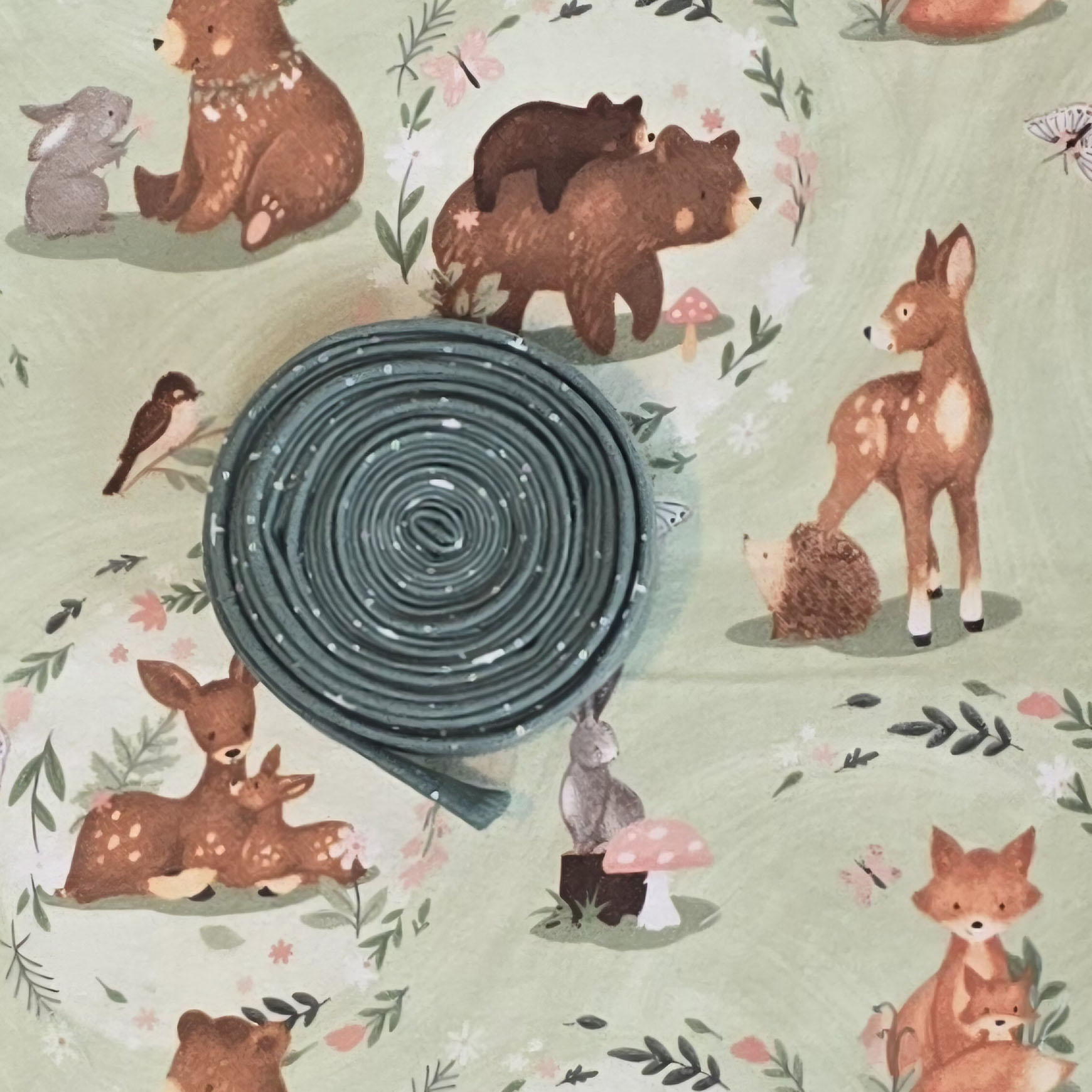 |
Either way, in Challenge 8, I’m walking you through my binding prep process—quick, simple, and (hopefully) painless!
💬 How do you store your prepped binding? I’d love to hear your tips!
📸 Don’t forget to share your challenge in the Quilt and Learn with Patterns By Jen Facebook group or on Instagram using #Snippets to inspire others! Not on social media? No problem—email me at jen@patternsbyjen.com.
Alright, quilter—go make something you LOVE! ❤️

New to Patterns By Jen?
Sign up for the new Inspire, By PBJ monthly digital subscription.
Don't forget to sign up for the Bites of PBJ newsletter while you are here for early releases and sales just for subscribers!
Patterns By Jen YouTube Channel
Find paper and digital patterns in my Etsy shop.
Find fun PBJ merchandise at Teespring
Join the Quilt and Learn with Patterns By Jen Facebook page.


